1.)Bar graphs - Bar graphs are best for comparing data across categories.

Advantages:
Represents data easily
Easy to make
Gives you results easier.
Disadvantages:
Represents data easily
Easy to make
Gives you results easier.
Disadvantages:
Graph categories can be reordered to emphasize certain
effects
Use only with discrete data
Limited space for labeling with vertical bar graphs
effects
Use only with discrete data
Limited space for labeling with vertical bar graphs
2.)Double graphs - Double Bar Graphs are good for comparing two sets of data
across categories.
across categories.

Advantages:
Great for comparing two sets of data.
Represents data easily
Disadvantages:
Not all intervals might work.
Great for comparing two sets of data.
Represents data easily
Disadvantages:
Not all intervals might work.
3.)Circle graphs- Circle graphs are best for comparing categories to the whole using percents.
Advantages:
Compares categories in parts of a whole using percents.
Disadvantages:
Its hard to get the percents of the categories.
Compares categories in parts of a whole using percents.
Disadvantages:
Its hard to get the percents of the categories.

4.)Line graphs- Line are best for showing changes over time.

Advantages:
Shows changes overtime.
Disadvantages:
Its harder to identify the intervals
Shows changes overtime.
Disadvantages:
Its harder to identify the intervals
5.) Pictographs - Pictographs are best for comparing data that can be
easily counted and represented using symbols.
easily counted and represented using symbols.

Advantages:
Easy to read
Disadvantages:
They all have to be the same size.
Easy to read
Disadvantages:
They all have to be the same size.
There are three ways a graph can be misleading.
1.) Changing the size of the bars - Making it look 3D, Making one look much
bigger than the other.
2.)Changing the scale - Making a break in the Y-axis.
3.)Making one picture look bigger.
1.) Changing the size of the bars - Making it look 3D, Making one look much
bigger than the other.
2.)Changing the scale - Making a break in the Y-axis.
3.)Making one picture look bigger.
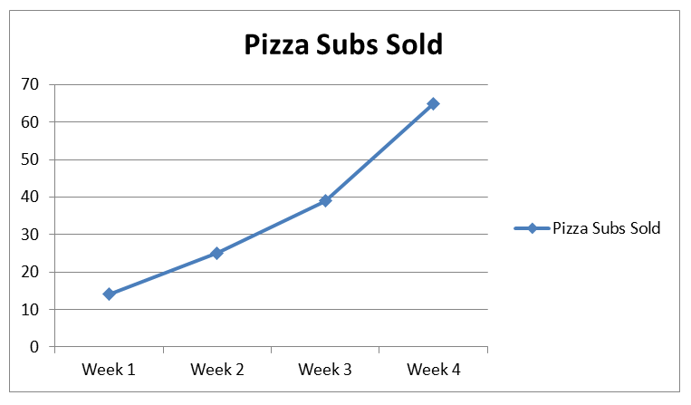
2a) The following chart shows Pizza Sub Sales over a month. What 2 graphs would
show the information accurately?
show the information accurately?
2b) If you were selling Pizza Subs would you
continue? How does your graph explain your answer.
continue? How does your graph explain your answer.
2A)I would use a pictograph so the data can be easily seen by percents, and it would also show how much people are buying.
2B)They should continue selling because there are many people buying pizza subs.

A.)Below you see 2 different examples of graphs showing healthy choices
sold at thecanteen. If you had to convince Mrs Mota that we should continue
sellinghealthy choices which graph would you choose?
B.) Change each graph so that your information looks even MORE impressive.
You may not change the data just the graphs.
sold at thecanteen. If you had to convince Mrs Mota that we should continue
sellinghealthy choices which graph would you choose?
B.) Change each graph so that your information looks even MORE impressive.
You may not change the data just the graphs.

A.) I would prefer a bar graph and circle graph because judging by the height of the bars amd the size of the collumns on the circle graph more and more people are eating healthy food choices.
B.) Modified Graphs
Note: All Graphs are created by me at createagraph.gov so don't accuse me of copy and pasting these graph just because they are perfect.


 Disadvantage- One disadvantage is that it can


