- Data can be presented using bar graphs , double bar graphs , circle graphs , line graphs, and pictographs.
- Different graphs may provide different information and display certain types of data better.
Bar Graph - Advantage: Bar Graph is the best for comparing data across categories.
- Disadvantage : When you make a bar graph you can't really see what is the exact number or its difficult to identify.
- Advantage: are best for comparing two sets of data across categories.
- Disadvantage:Use only with discrete data
- Advantage: are best for comparing categories to the whole using percents.
- Disadvantage:you'll take more time doing and finding the percent.
- Advantage: Line Graphs are best for showing changes in data over time.
- Disadvantage-it use only with continuous data.
- Advantage:are best for comparing data that can be easily counted and represented using symbols.
- Disadvantage: It is good for only whole numbers .

Double bar Graphs
Circle Graphs

Line Graphs

Pictographs
2. How can graphs be misleading. Show it 3 ways.
1. Distorting the Scale (break the y-axis)
2.Distorting the Visuals (drawing different sizes for the pictographs)
3.Distorting the size of the bar (make the bar 3D or make it wider)
3. a) The following chart shows Pizza Sub Sales over a month. What 2 graphs would show the information accurately?


I would use Line graph and Bar Graph
3.b) If you were selling Pizza Subs would you continue? How does your graph explain your answer.
3.b) If you were selling Pizza Subs would you continue? How does your graph explain your answer.
Yes, I would continue selling pizza subs because every week the items that are sold are increasing .The trend is going up .
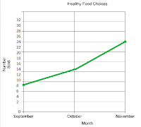
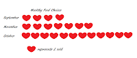
4. Below you see 2 different examples of graphs showing healthy choices sold at the canteen. If you had to convince Mrs Mota that we should continue selling healthy choices which graph would you choose?
If I had to convince Mrs. Mota that we should continue selling healthy choices I would use Line Graph.
If I had to convince Mrs. Mota that we should continue selling healthy choices I would use Line Graph.

4a) Change each graph so that your information looks even MORE impressive. You may not change the data just the graphs.
No comments:
Post a Comment
Note: Only a member of this blog may post a comment.