- Bar Graph
Advantages - Comparing data across categories.
Disadvantages - Can't compare two or more different sets of data and depending on the scale or interval, the exact number is not clear or can be difficult to identify.
Ex.
- Double Bar Graph
Advantages - Comparing 2 sets of data across categories.
Disadvantages - If a double bar graph has too many series of data it could be confusing to read. Also depending on the scale or interval, the exact number is not clear.
Ex.

- Line Graph
Advantages - Shows changes in data over time.
Disadvantages - Just like a bar graph,and double bar graph depending on the scale or interval the exact number is not clear.
Ex.
- Circle Graph
Advantages - Comparing categories to whole in percentage.
Disadvantage - You have to calculate the percentage of each piece of data.
Ex.
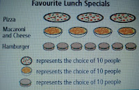
- Pictograph
Advantages - Comparing data that can easily be counted, and represented using symbols.
Disadvantages - Hard to find the exact amount of partial symbols.
Ex.
2. How can graphs be misleading. Show 3 ways.
* Distorting the scale (break in the y-axis)
Ex.
Ex.
*Distorting the size of the bars (making the bar wider OR make a bar appear 3-D)
Answer: I would continue selling Pizza Subs because, the Pizza Subs sold each week is increasing. A line graph would show changes in the data over time and the trend would be going up.


No comments:
Post a Comment
Note: Only a member of this blog may post a comment.